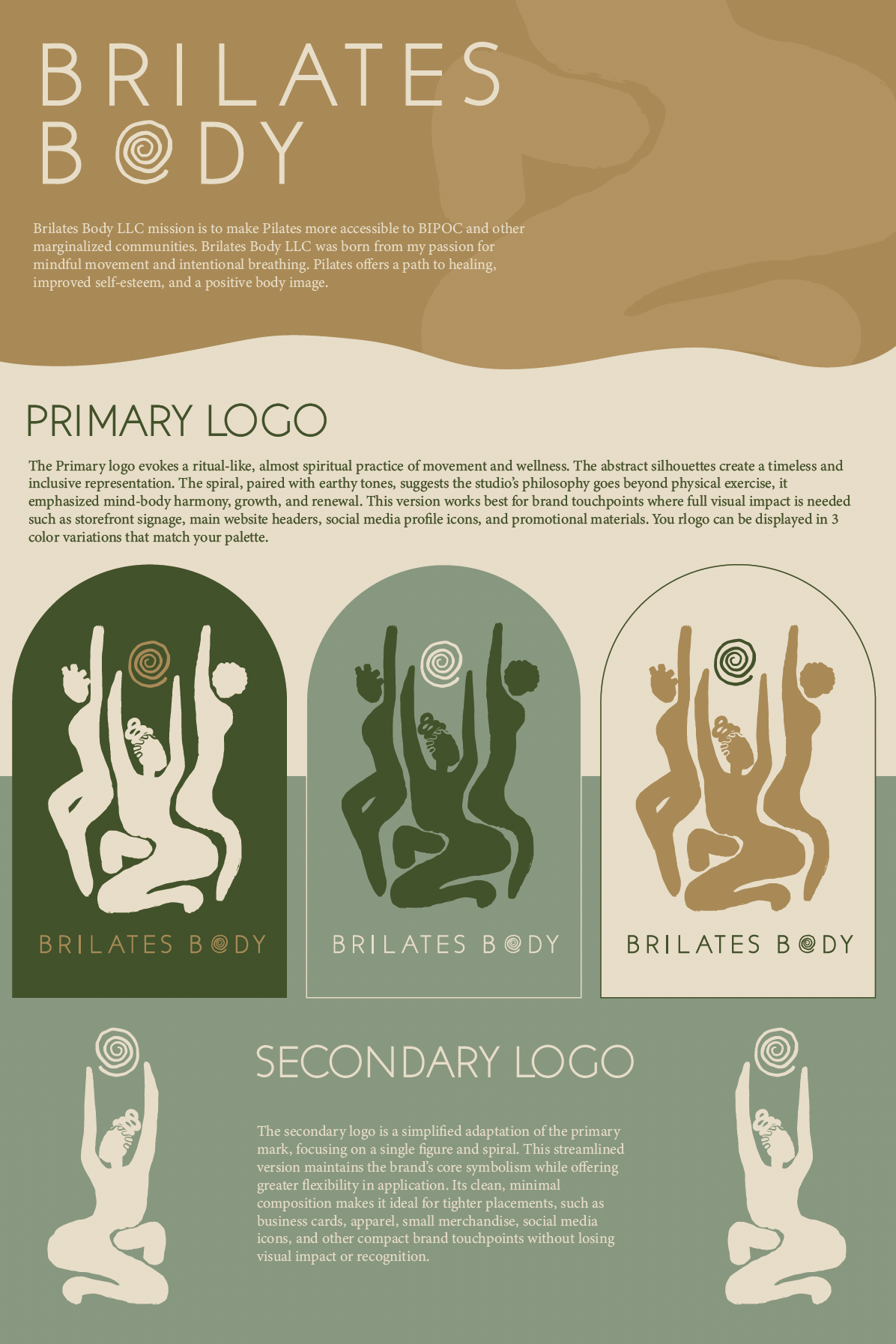
BRILATES BODY LLC
Branding Kit & Logo
Brilates Body, a Pilates studio with a strong commitment to inclusivity and community, sought a refreshed, organic brand identity that would feel welcoming and empowering—especially for the BIPOC community. The goal was to create a visual system that communicated strength, wellness, and authenticity while breaking away from the sterile, overly minimalist aesthetics often associated with boutique fitness.
This refreshed visual identity equips Brilates Body with a cohesive and versatile brand system supporting marketing materials, signage, social media, and community outreach while authentically representing its mission to be an inclusive, uplifting space for movement and healing.
The programs and softwares utilized: Adobe Illustrator & Procreate


DAILEY LLC
Branding Kit & Logo
"Dailey" is a software creation and consulting firm passionate about solving problems faced by small companies through innovative and whimsical software solutions.
Together we were able to create The "Dailey" logo which cleverly integrates the essence of technology by subtly forming the shapes of zeros and ones within its rounded, soft typography. This design nods to the fundamental binary code that powers all software, representing innovation at its core.
Despite this technical underpinning, the gentle curves and playful structure of the letters maintain a friendly and approachable feel, reflecting Dailey’s commitment to creating user-friendly and accessible solutions.
The programs and softwares utilized: Adobe Illustrator & ProCreate


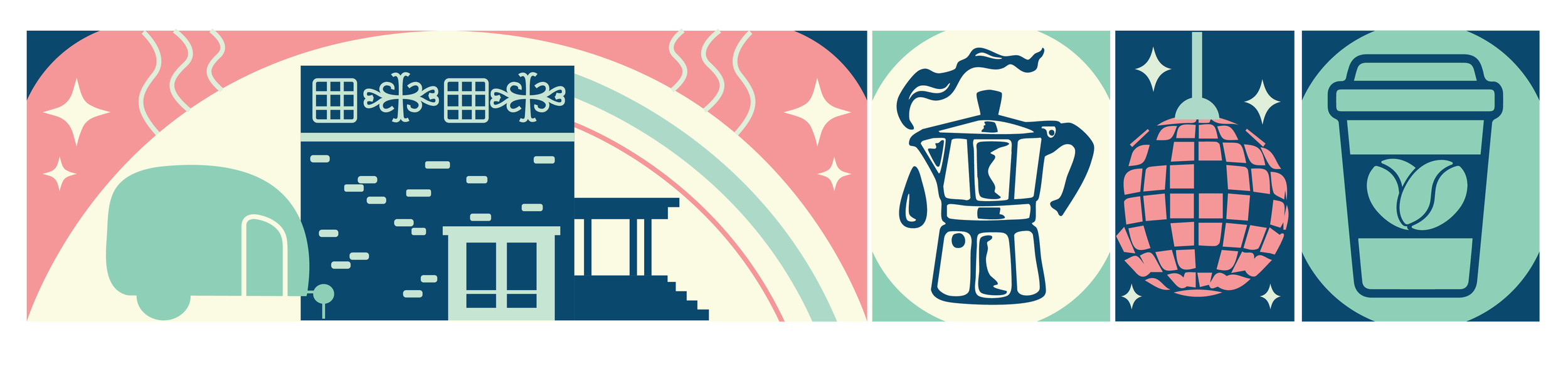
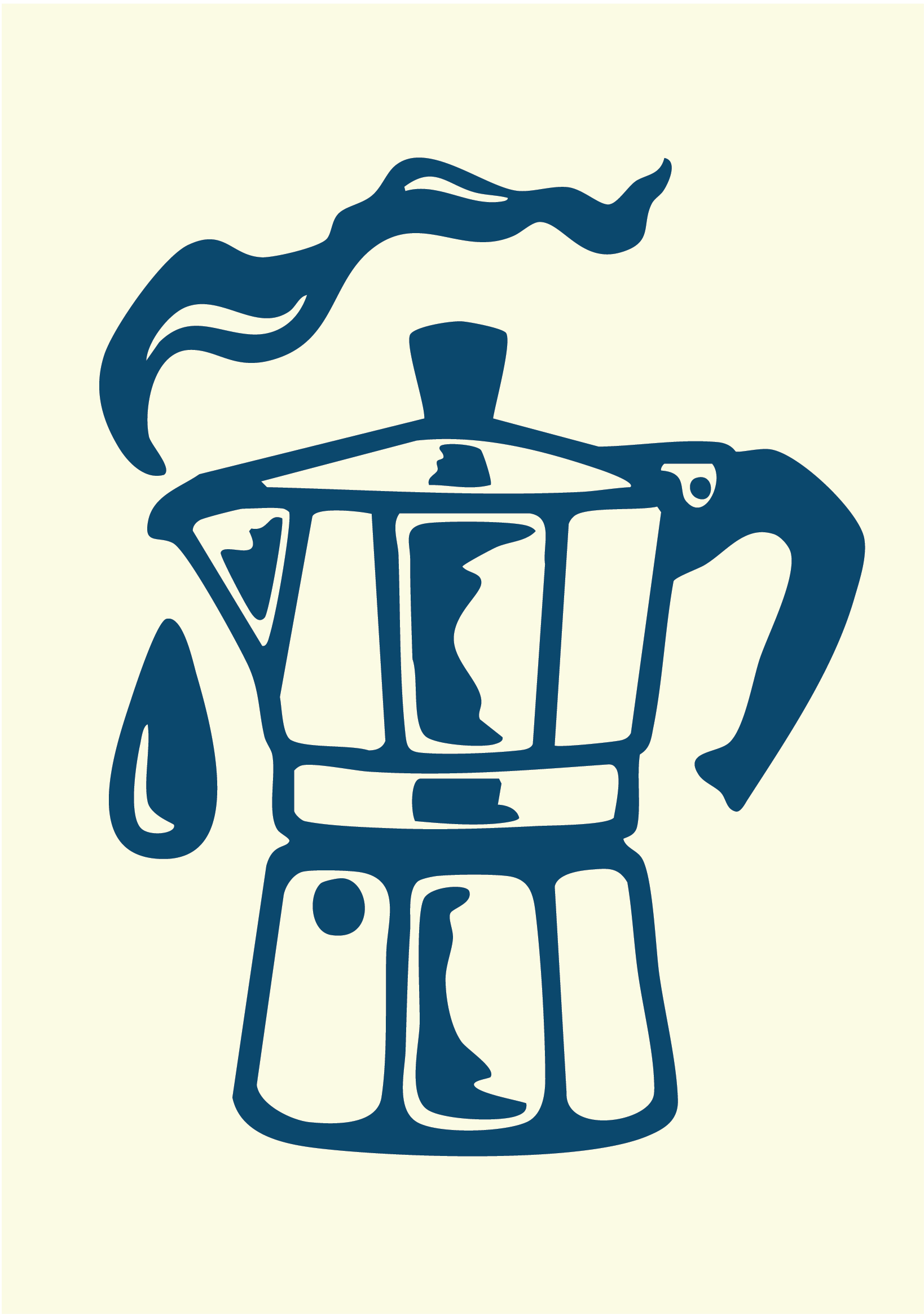
HASTA LUEGO FRIEND
Hasta Luego Friend is more than just a brand, it's a celebration of fun and unity inspired by the blend of family, music, art, food, drink, and latin cultures. In a world where everyone knows a little Spanish, Their brand brings a playful and humorous touch with Spanglish. At its core, Hasta Luego Friend is about building a community where everyone, regardless of background, is welcomed with open arms.
As the brand expands into a brick-and-mortar space, Their rebrand represents the evolution of Hasta Luego. Inspired by Spanish-style coffee and culture, the design symbolizes growth, movement, and connection. The logo reflects its deeper purpose: creating a warm, inclusive environment that celebrates LGBTQ sapphic identity and shared cultural experiences. It captures both the roots and the rising; honoring where we started, and where we’re going.
The programs and softwares utilized: Adobe Illustrator & ProCreate